

The Calm Palette: Using Colour to Support Your Nervous System
Primary Colour Therapy: A Practical Way to Bring Calm Into Your Week
Colour affects us whether we pay attention to it or not. We register it through the nervous system first and the mind second. That is why a room can feel soothing or agitating before you can explain why.
Colour therapy can get very woo very fast. I am not interested in that. I am interested in the practical use of colour as a simple environmental tool, like light, sound, or scent. Small cues can help your system settle when life is loud.
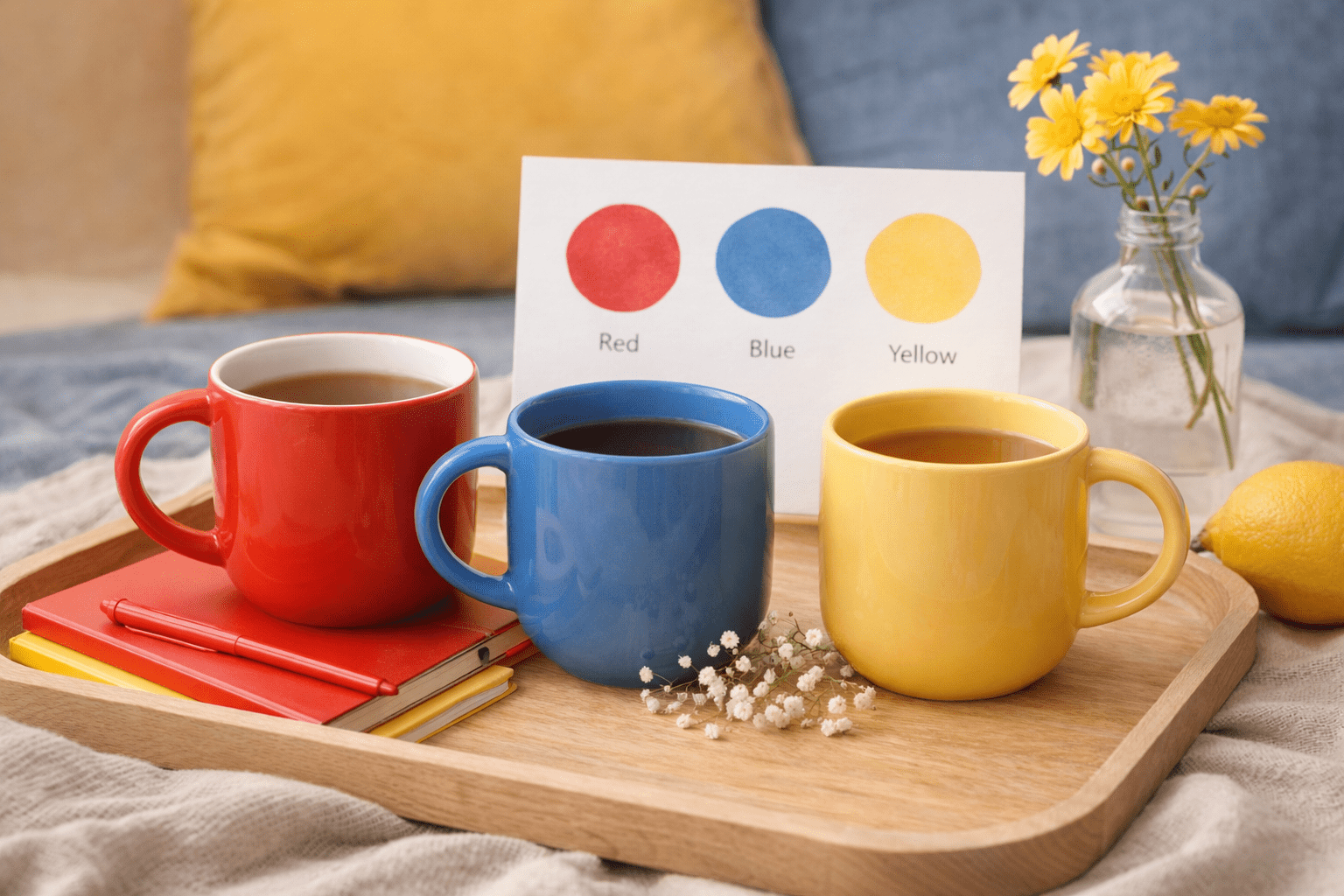
Primary colours are the building blocks: red, blue, yellow. They are strong, direct, and easy to use in small doses. For calm, we are going to lean on blue, then use a touch of warmth so calm does not become flat or chilly.
A grounded way to work with colour
Instead of asking what a colour “means,” ask:
- What does my body do around this colour
- Do I feel more alert, tense, calm, or open
- Do I need more activation or more settling today
This turns colour into a practical support rather than a belief system.
Blue as the calm anchor
Blue is often experienced as cooling and stabilizing. It can reduce the feeling of internal noise and support steadier thinking. It is a great choice when you need calm without sedation.
Use blue when you want:
- Less emotional static
- Clearer thinking
- A steadier mood
- A calmer home atmosphere
A quick caution: if you are feeling low or isolated, too much cool blue can sometimes feel heavy. That is why we pair it with soft neutrals or gentle warmth.
Warmth matters
For calm that feels safe rather than numb, add a small amount of warmth:
- muted yellow
- warm beige
- soft cream
- warm lamp light
This supports the nervous system in a quiet, grounding way.
A 7 Day Colour Plan for Calm
This plan is designed to lower baseline stress. It is not meant to force relaxation. You do not need to do everything listed. Choose one or two elements per day. The key is consistency.
Day 1: Create a visual anchor
Colour focus: soft blue
Pick one steady blue cue you will see often.
- Change your phone or desktop background to a muted blue
- Place a blue item where your eyes naturally land (desk, bedside, kitchen)
- Wear a blue or blue grey layer
The point is familiarity. Familiarity reduces load.
Day 2: Quiet the sensory field
Colour focus: blue plus neutrals
Today is about less stimulation.
- Dim overhead lights and use a warm lamp in the evening
- Choose low contrast clothing and avoid loud patterns
- Sit near natural sky tones for a few minutes, no scrolling
Less visual noise helps the nervous system downshift.
Day 3: Add gentle warmth
Colour focus: blue plus warm beige or muted yellow
Prevent calm from turning cold.
- Use warm lamp light in the evening
- Pair a blue space with a warm throw, cream pillow, or beige blanket
- Choose a warm mug or warm toned dishware with blue accents
Warmth signals safety.
Day 4: Move calm into the body
Colour focus: blue plus soft neutrals
Use calm colours during gentle movement.
- Wear blue while walking or stretching
- Take a shower with softer lighting and a calm, uncluttered bathroom space
- Keep your environment visually quiet while you move
Calm becomes more stable when your body experiences it.
Day 5: Quiet the mind
Colour focus: blue plus low contrast
Reduce mental noise through visual simplicity.
- Use a blue notebook for planning or journaling
- Switch screens to dark mode or blue toned modes
- Avoid bright colour input during work or reading
Lower contrast supports cognitive rest.
Day 6: Emotional buffering
Colour focus: blue plus muted green or soft grey
Support regulation without numbing.
- Spend time outdoors in shaded greenery or near water
- Add a plant to a blue toned space
- Choose grey blue clothing on high emotion days
Blue stabilises. Green reassures.
Day 7: Integration
Colour focus: your best calming blend
Keep what actually helped.
- Notice which colours and combinations felt most soothing
- Keep those cues present going forward
- Drop anything that felt like effort
Calm is personal. Let your system lead.
Simple combinations that support calm
If you want a quick guide:
- Blue + warm beige: steady comfort
- Blue + muted yellow: calm plus optimism
- Blue + soft grey: calm plus clarity
- Blue + muted green: calm plus emotional steadiness
A Magic North Star note
This is not about believing colour has mystical power. It is about recognizing that your environment shapes your nervous system and colour is one of the easiest levers you can adjust. A hard week does not always need a big solution. Sometimes it needs small, repeatable cues that tell your body, we are safe enough to soften.